Why nonlinear relationships get hidden or misconstrued by the standard first look at a dataset, and a small open source tool for orbit plots.
"Correlation is not causation" is the common line every data scientist learns, just because there's some relationship between two variables doesn't mean one causes the other.
Measuring association however is still a very common and vital task in exploratory data analysis, even without considering any causal claims.
This article, and the Arbital Python package motivating it, don't touch on the "correlation is not causality" aspect. Instead, both are about the other problems with correlation.
Plot your data. It's the oldest advice in statistics and easy to rush through once a dataset has more than a few columns, because let's be real plotting forty plus variables against a target one at a time gets boring, instead df.corr() and a heatmap plot is the usual go to.
Correlation is a convenient metric to reach for, effective and not necessarily wrong (especially for linear estimators and GLMs).
Where it stops being appropriate: a real relationship that's nonlinear, which correlation just doesn't see, and Simpson's paradox, which it sees and misconstrues. Both are readily catchable by eye, once plotted. Neither is catchable by a correlation coefficient on its own, which is the most common way association actually gets measured.
Misconstrued Meaning: Simpson's paradox
Simpson's paradox is one gotcha I've come across quite often, and it's rarely caught by staring at a table of coefficients. It's caught by actually plotting the data, because a pooled relationship and the same relationship split by subgroup can point in completely opposite directions, both computed correctly, and a single number can't tell you which one you're looking at. It's not a rare textbook curiosity. It shows up whenever some subgroup structure is quietly driving both variables at once, which describes many real world datasets.
Take the well known Palmer penguins dataset, a few hundred rows of bill and body measurements across three species, a staple of introductory data science courses. Compute the correlation between bill depth and body mass across the whole dataset and you get r = -0.47: a moderate negative relationship. Deeper bills, the number says, go with lighter birds.
Now split by species and look again. Within Adelie, within Chinstrap, within Gentoo, the relationship is positive, in every group, without exception. Deeper bills go with heavier birds. Spearman rank correlation does no better here (ρ = -0.43). The pooled correlation didn't just understate the relationship. It misconstrued it entirely, because Gentoo penguins happen to be both the heaviest species and the shallowest-billed one, and pooling the three species let that between-group difference masquerade as a within-group effect.
Plotting it shows this immediately:
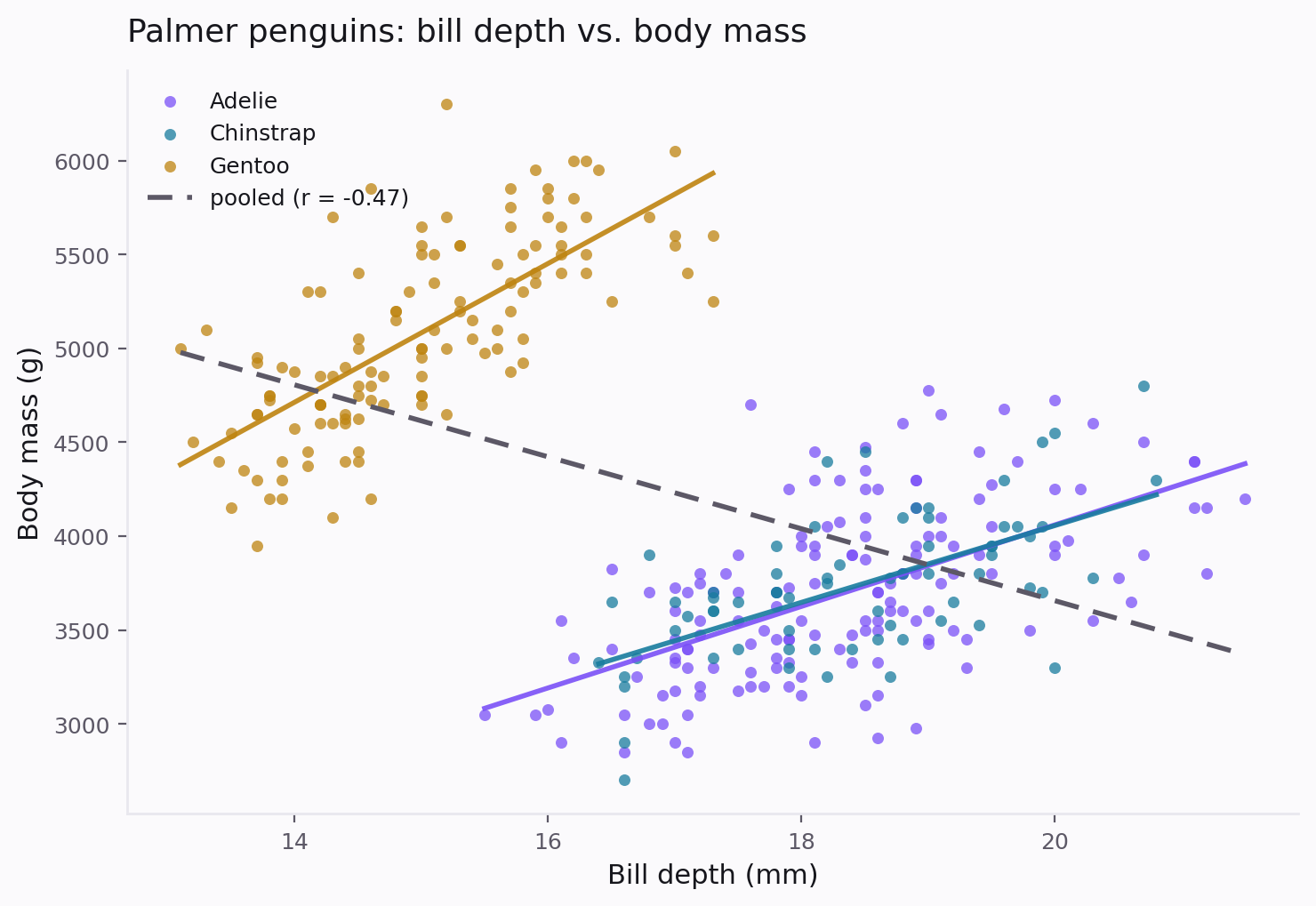
Three separate, obviously positive clouds of points, that a single dashed trendline through all of them flattens and reverses. The fix is fairly simple, once someone discovers it. The problem is that this level of exploration takes time when there are many variables and is usually missed by automated routines e.g. agentic data analysis or autoML approaches.
Hidden relationships correlation doesn't see at all
Simpson's paradox is where correlation gets it wrong. Another common failure is correlation seeing nothing at all where there's a real, strong, almost deterministic relationship.
Non-monotone relationships. A parabola, or a sine wave, can have a correlation near zero while being a completely deterministic function of the input.
Interactions. If y = x1 * x2, plus noise, each parent variable, x1 and x2 alone, can be individually uncorrelated with y, not just weakly or nonlinearly related to it, because the other parent randomly flips the sign of its effect and the correlation averages that flip away entirely.
What arbital does about the gap
Correlation is the standard data science workflow for a reason. It's simple, one line, and a heatmap the whole team already knows how to read. Arbital tries to keep that simplicity while giving a more complete picture, not replace it with something that requires more expertise to interpret. Linear correlation is still directly readable off an orbit plot from arbital. What's added is the very solution to the problems outlined above, based around mutual information as the measure of association.
Arbital, a small open source Python package, computes both correlation and an estimated mutual information for every variable against a chosen target, and places each variable on an orbit plot.
Arbital: Association Radii By Information Theoretic Association Learning
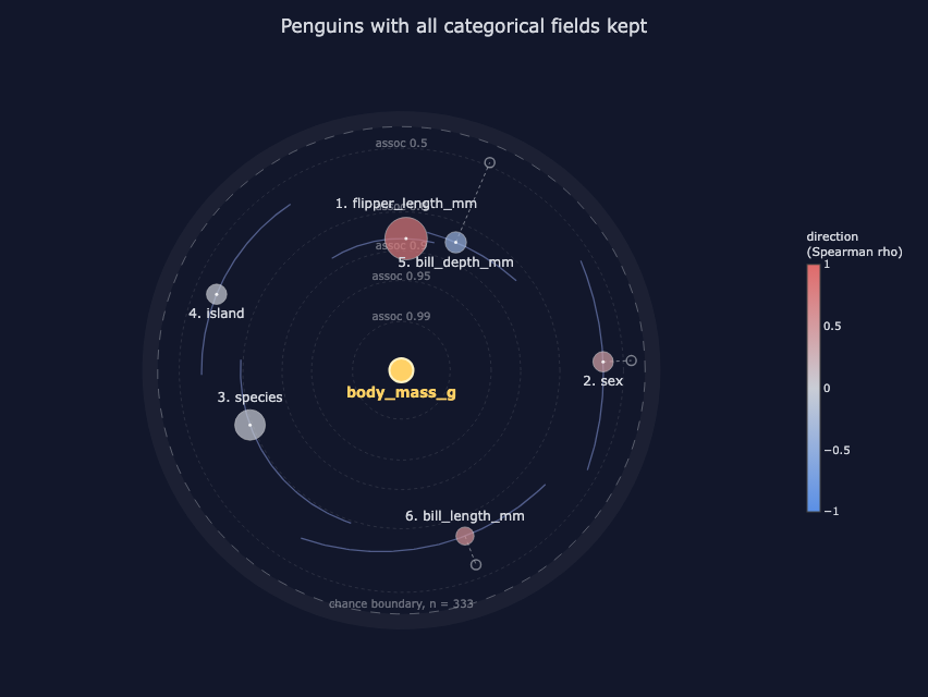
The shape alone carries the headline: closer to circular means correlation already measured the majority of the association, more elongated (elliptical) means that the relationship is more nonlinear.
-
Radius encodes total association, on a bounded [0,1] scale via Linfoot's informational coefficient of correlation, a decades old result that converts mutual information into something directly comparable to |ρ|. Closer to the centre is stronger association.
-
A hollow ghost marker shows where correlation alone would have placed the same variable, connected to the real marker by a tether. The length of that tether is the association correlation alone is missing.
-
The orbit's eccentricity is the nonlinear share of the association: a circular orbit means a purely monotone relationship, an elliptical one means a more complicated relationship but a relationship nonetheless.
-
The angle groups mutually redundant variables together, so a cluster of near-duplicates is readily visible.
-
A dashed chance boundary, calibrated against shuffled copies of the target, marks the point beyond which an apparent association is indistinguishable from noise at your sample size.
Run on the penguins data, bill depth's ghost marker sits far out near the rim, close to where the pooled r = -0.47 would place it, so the correlation reading is still right there if that's all you wanted. The real marker sits close in, at r_info = 0.86, one of the strongest associations in the dataset, with an eccentricity/nonlinearity of 70 percent: the figure shows both readings, and the size of the gap between them, in one glance.
Association is a more fundamental concept than correlation. Correlation is one particular, convenient slice of it, the slice that happens to be linear, or at best monotone. Arbital's whole premise is that you shouldn't have to give up correlation's intuitiveness and ease to see the rest of the picture.
Five lines
import arbital
from arbital import datasets

penguins = datasets.load("penguins")

# space, as in feature space
space = arbital.orbits(penguins, target="body_mass_g")
space.to_html("penguins.html")
space.table() and space.to_df() return the same numbers behind the figure (mutual information in nats, r_info, the nonlinear share, chance levels, feature-selection gains) as plain Python, for anyone who wants the values without the plot.
What this is not
Arbital is an exploratory screen, not a causal claim. Nothing in it explains why bill depth and body mass move together within species, only that they do, more strongly than the pooled correlation suggested.
The chance boundary is a heuristic, calibrated at a single confidence level with no multiple-comparison correction applied automatically: useful for a first look at a manageable number of variables, not a substitute for a pre-registered hypothesis test.
Every estimator in arbital; the k-nearest-neighbour mutual information estimator, the Ross estimator for mixed continuous-categorical pairs, Linfoot's coefficient, greedy mRMR selection, implements a published, well-established method, the contribution here is the orbit visualization and the calibration layer around them, not a new estimator.
The core install is NumPy only (pip install arbital); plotting and the bundled example datasets are optional extras.
The full vignette, with worked examples on interactions, time-lagged variables, and mixed categorical data, can be found in the docs. Arbital is open source, MIT licensed.
- Documentation: https://aaronbyrnephd.github.io/arbital/
- Source: https://github.com/aaronbyrnephd/arbital
- PyPI: https://pypi.org/project/arbital/
Key References
Pearson, K. (1895). Notes on regression and inheritance in the case of two parents. Proceedings of the Royal Society of London, 58, 240 to 242.
Shannon, C. E. (1948). A mathematical theory of communication. Bell System Technical Journal, 27, 379 to 423.
Linfoot, E. H. (1957). An informational measure of correlation. Information and Control, 1(1), 85 to 89.
Ross, B. C. (2014). Mutual information between discrete and continuous data sets. PLoS ONE, 9(2), e87357.
Peng, H., Long, F., & Ding, C. (2005). Feature selection based on mutual information: criteria of max-dependency, max-relevance, and min-redundancy. IEEE Transactions on Pattern Analysis and Machine Intelligence, 27(8), 1226 to 1238.